

The Power of Visuals: Finding Balance in Graphic Design
Graphic design is an essential element of any visual communication strategy. It helps to convey messages, set a tone, and create meaningful experiences for viewers. But finding the right balance in graphic design can be a challenging task. Too often, designers are caught between creating something that looks aesthetically pleasing but fails to communicate its intended message or making something visually striking but overly complex.
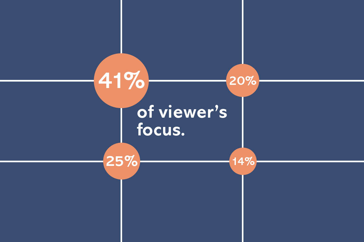
Visuals & Graphic Design
Graphic design is a powerful tool in today’s world. It helps to express ideas, engage with audiences and create visually appealing images that stand out from the crowd. But how do you successfully balance creative visuals with effective graphic design principles? This article will explore the power of visuals and how to find a happy medium between striking imagery and practical design elements.
As visual storytelling continues to grow in popularity, being able to create dynamic graphics that capture attention is essential for success. Graphic design should be used strategically to not only make a statement but also inform viewers of the message they’re trying to convey. To ensure visuals are both impactful and effective, designers should focus on finding harmony between stunning artistry and sensible layout structures.
The key lies in understanding which components contribute to creating an eye-catching design while still ensuring its usability. The best designers use graphic design to create an emotional connection with the viewer. They strive to forge relationships that are memorable and long-lasting.
Establishing Visual Balance
Graphic design is an art and a science. A good graphic designer needs to have a keen eye for detail, balance, proportion, and composition. But it’s not just about technical skills—visuals can be powerful tools to evoke emotion and direct attention. Establishing visual balance in any given work of graphic design is essential in order to create something that looks professional and effective.
Designers must consider the layout of the image they are creating while also considering the elements that will make up the image itself—color, text, shapes, etc.—in order to achieve visual balance in their work. It’s important that all elements harmonize with one another but still remain distinct enough so as to not compete with each other for attention or look cluttered or overwrought. The goal is for all components of the design to come together seamlessly as a whole.
Color Theory & Harmony
Color theory and harmony are two essential concepts in graphic design, as they enable designers to create balanced visual compositions that achieve specific goals. Working together, color theory and harmony set the stage for effective communication with viewers of any design work. By understanding how colors interact and influence each other, designers can craft pieces full of depth and clarity.
In order to create balance in graphic design, it is important to be familiar with the principles of color theory, which is focused on understanding how colors interact when placed together. This includes recognizing how colors relate to one another through contrast or similarity, their ability to elicit emotion from viewers, and the impact they have on message interpretation.
Color harmony can be achieved by using complementary colors that make up a pleasing combination or analogous colors that create a more calming effect. By considering these factors during the design process, designers can ensure their visuals communicate effectively with audiences.
Working with Fonts
Fonts are an integral part of any graphic design project, and finding the right balance between font size and typeface is key to creating a successful design. Working with fonts effectively can be both difficult and time-consuming, but it is worth the effort when it comes to crafting an eye-catching and impactful visual.
When choosing a font for your next project, consider its purpose within the context of your design. Is the text meant to draw attention? If so, use a bold or large font that stands out from other elements in the composition. On the other hand, if you want to convey subtlety and sophistication, opt for a thin or elegant typeface that complements the background color scheme. Additionally, make sure you select a legible font so that viewers can read your message without any difficulty.
Incorporating Shapes & Lines
Visuals are a powerful tool that can be used to effectively communicate an idea, emotion, or message. In graphic design, shapes and lines play a crucial role in creating the perfect balance between the visual and the content. When incorporated correctly, shapes and lines can bring out the desired result in any piece of artwork or design.
Shapes and lines have many properties that can be utilized to influence how a viewer perceives a certain image. They can give emphasis to certain elements of artwork by making them stand out from their surroundings. Furthermore, they create order by separating parts of an image into distinct sections which makes it easier for viewers to interpret what is being presented. Lines also aid in establishing movement within an artwork by leading viewers’ eyes around the page.
Choosing Images
Choosing the perfect images is an essential part of graphic design. Not only do visuals add to the overall aesthetic of a project, but they also help to convey a certain message or idea. For example, certain colors may be used to evoke feelings of happiness or comfort while a different image could give off a feeling of sadness or mystery. Finding the right balance between visuals and text can help create powerful designs that capture the attention of viewers.
When selecting images for graphic design projects, it’s important to think about how each visual element will contribute to the overall message being conveyed. It’s also important to consider which elements might distract from that message and which ones are complementary. Choosing the right stock photos for your graphic design projects, you want to make sure that the images have enough visual appeal to capture attention. If the pictures are too bland or boring, viewers may not be interested in what you have to say.
Conclusion
Visuals, or graphics, are an important part of graphic design. They can help to convey a message, set the tone for a project, and provide visual interest. Finding balance in graphic design is essential to making sure that visuals are used effectively and appropriately.
In conclusion, it is clear that visuals have an immense amount of power when used correctly. As designers, we must be mindful not to overwhelm our projects with too many visuals as this will detract from their effectiveness. We must also be aware of how our visuals are communicating messages both intentionally and unintentionally which could lead to misinterpretations or confusion by viewers. By taking all these factors into consideration we can find the right balance for our designs, creating powerful visuals without going overboard or missing out on delivering our intended message.
Hope you found something valuable in this article, if you like it, please share it with others too. Please tell me what you think, and I will reply to you. Thank you for reading.